

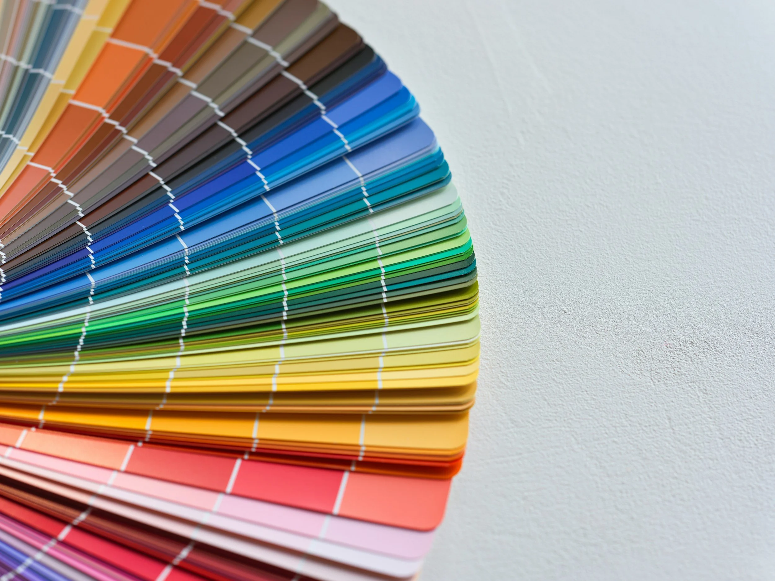
It’s that time of year again: paint companies are unveiling their Colors of the Year, along with the palettes they believe will shape our homes in the months ahead.
Having spent several years working in marketing for a major paint company, I have an appreciation for how much work goes into these selections. There’s considerably more to it than gathering around a table and saying, “How about green?”
The color marketing teams look well beyond paint. Fashion, the economy, the political climate, nature, and broader cultural shifts all help inform their forecasts. The process starts long before the announcements, as they consider which colors might resonate with people—and why.
What always made me smile, though, was the difference between the annual excitement around a new color and how people actually decorate. Most of us aren’t repainting our homes every year. There’s the expense, the disruption, and the small matter of moving everything away from the walls. I love a fresh look, but my furniture and I have our limits.
In fashion, trying a new color can be as simple as buying a scarf or a T-shirt. Bringing it into your home can feel like a much bigger commitment.
Color forecasts can have that same gradual influence. You may never paint your living room in a particular year’s chosen shade, but you might find yourself drawn to it later in a pillow, a throw blanket, or a piece of artwork.
My advice? Enjoy the forecasts but choose colors you love. You’re the one who has to live in your home, and a Color of the Year announcement doesn’t mean your favorite wall color has suddenly expired.
Before committing, consider the room as a whole. Lighting has an enormous influence on how a color appears, so test samples in your space and look at them at different times of day. Take your furniture, artwork, rugs, and adjoining rooms into account, too. Unless you’re starting from scratch, your new color needs to work with what’s already there.
And if you love one of the new shades but aren’t ready to commit to four walls, start small. An accessory or a painted accent piece might give you just enough of it.
With that in mind, let’s look at the announced Colors of the Year—and where I could see them working in a home.
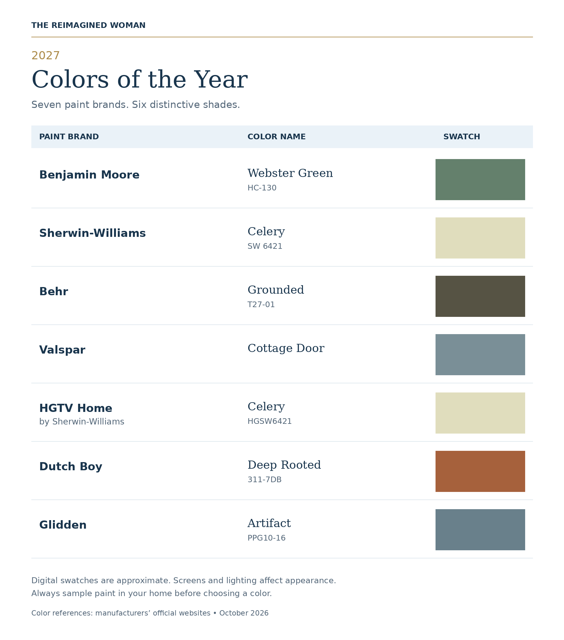
Greens have been having a moment for the past several years, and it looks like they’re not going anywhere. Benjamin Moore’s Webster Green is a rich, more saturated green, while Behr’s Grounded takes a more earthy approach, with brown undertones that give it a mossy depth. Both are on the darker, moodier side, making them excellent choices for creating a bold statement.
I can easily envision these shades on a bathroom vanity, kitchen cabinetry, or architectural millwork. And for those willing to go a little bolder? An entire room enveloped in one of these rich colors could feel wonderfully decadent, yet warm and cozy.
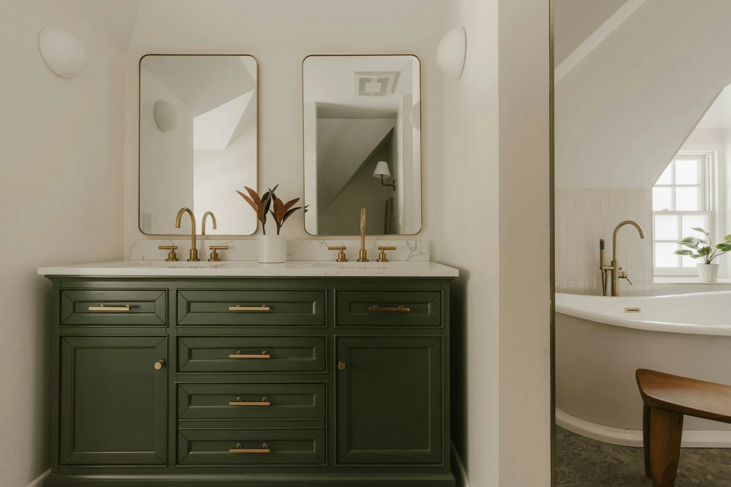
Photos are for inspiration and may not feature the paint colors discussed. Colors also vary with lighting and screen settings—always test a sample in your own space.
Sherwin-Williams’ Celery is another shade that has been making its way into interiors for the past several years. With its soft yellow-green undertones, it feels like a subtle nod to chartreuse, but in a much more understated, livable way.
There’s a softness to Celery that makes it particularly soothing for a bedroom or living space. It pairs beautifully with both light and dark browns, as well as other shades of green, creating a warm, nature-inspired palette. For those feeling a little more adventurous, try introducing pinks, blues, or even touches of red for an unexpected pop of color.
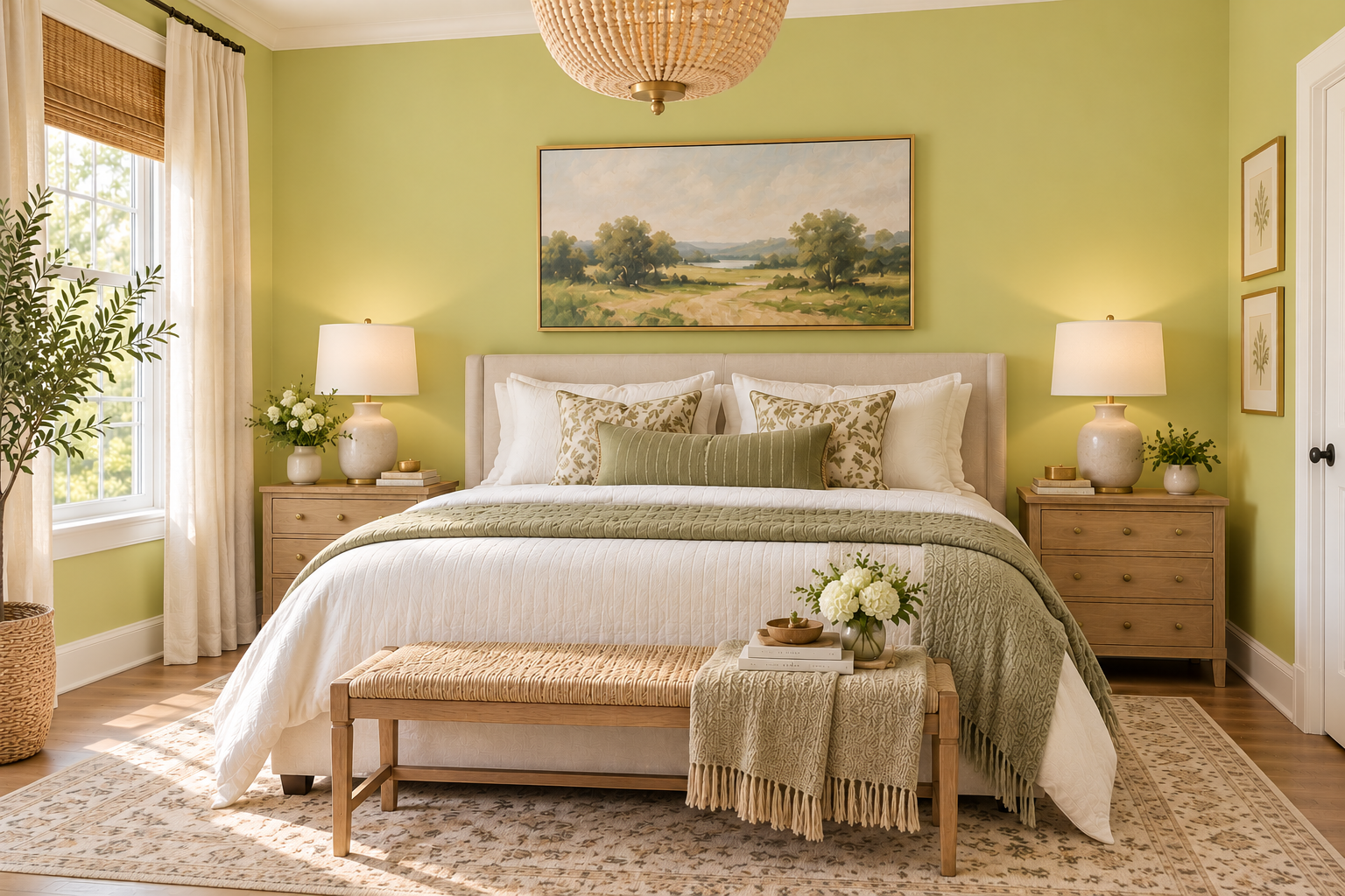
Photos are for inspiration and may not feature the paint colors discussed. Colors also vary with lighting and screen settings—always test a sample in your own space.
Valspar’s Cottage Door and Glidden’s Artifact both fall into the family of muted, moody blues, with a slate-like quality that gives them a sophisticated, timeless appeal.
I’ve always been a big fan of blue, so these two are right in my wheelhouse. I can envision them on kitchen cabinetry, bathroom vanities, and statement furniture pieces, but they would be equally beautiful in bedrooms and living spaces where you want to create a refined, inviting atmosphere.
And personally? I especially love the idea of a dining room painted in one of these deeper blues. There’s something about a richly colored dining room that instantly elevates the space, making it feel both elegant and intimate.
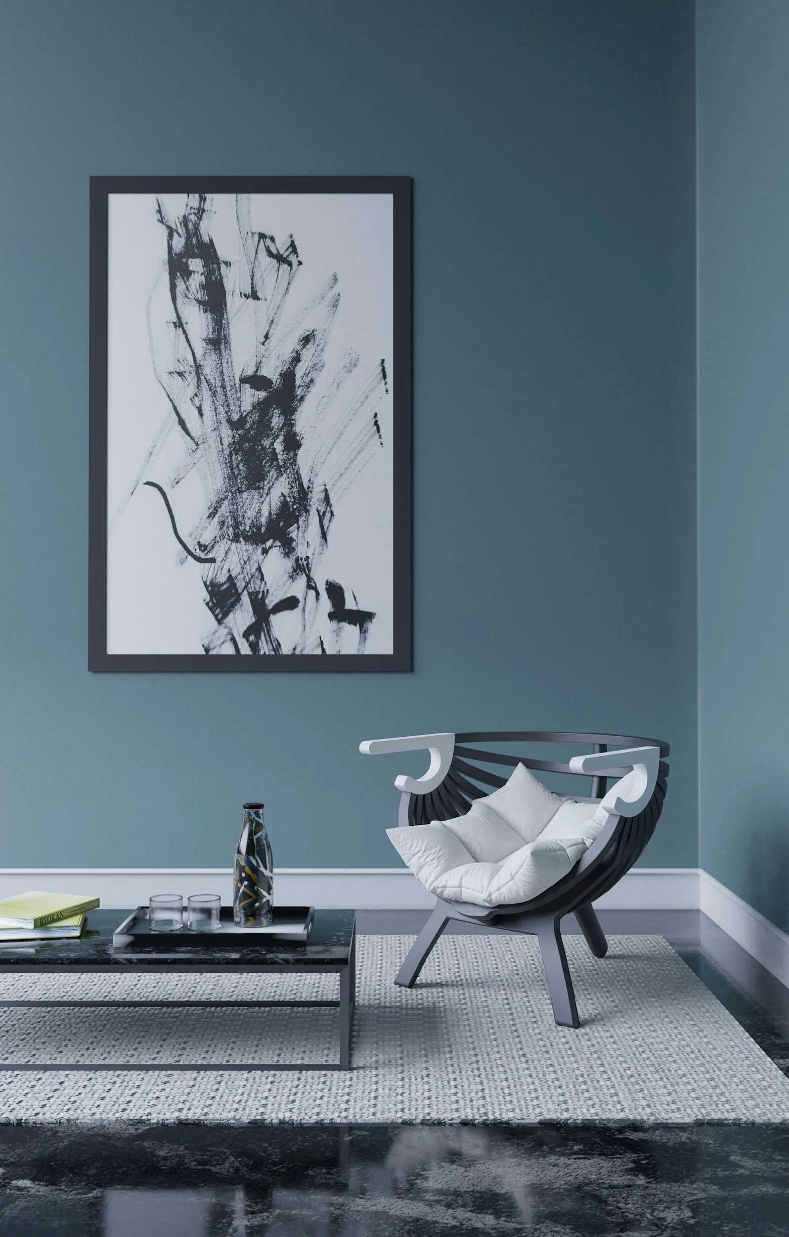
Photos are for inspiration and may not feature the paint colors discussed. Colors also vary with lighting and screen settings—always test a sample in your own space.
And last but certainly not least, we have Dutch Boy’s Deep Rooted. In recent years, we’ve seen a noticeable shift toward warmer, earth-toned colors, and this shade fits right into that trend.
While these warmer, earthy hues aren't necessarily my personal favorites, I can certainly appreciate their ability to bring warmth and character to a space. Colors like Deep Rooted have long been associated with Southwestern interiors, but they also evoke the rich, sunbaked tones of Tuscan-inspired design.
I can easily envision this color in a cozy living room, paired with light-toned woods, rich chocolate browns, and warm whites. The combination creates an inviting, grounded atmosphere that feels both comfortable and welcoming.
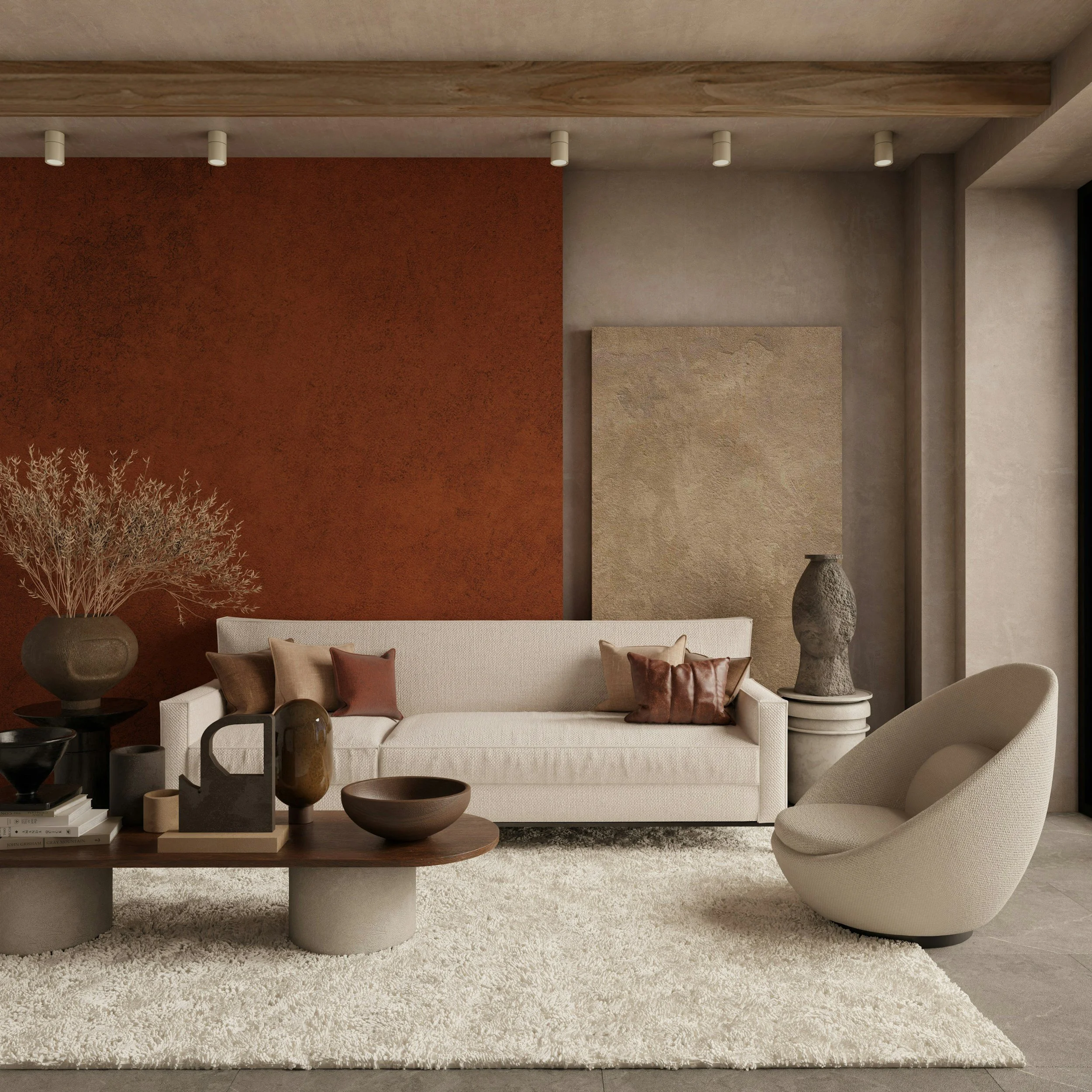
Photos are for inspiration and may not feature the paint colors discussed. Colors also vary with lighting and screen settings—always test a sample in your own space.
At the end of the day, color is very subjective. Trends may come and go, but the colors you choose for your home should reflect your personal taste and what makes you feel good in your space. After all, you're the one living there! So whether your favorite color is trending or not, choose what you love and make your home your own.
XO
Jess
